12:00 am

Work » Web Design » Greg Rucka.com

Greg Rucka.com

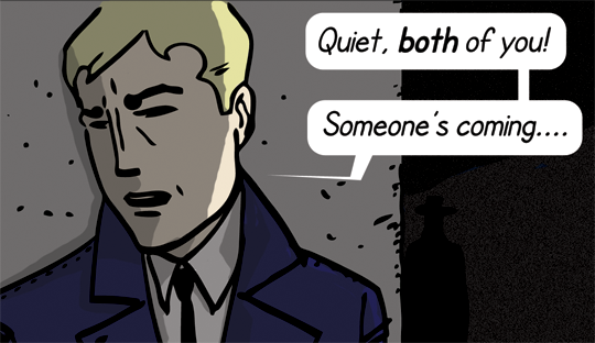
Client is a best-selling and award-winning writer of comics and thriller novels, and at first offered no input on the design process. After trying to adapt my design style to the thriller genre, and turning out what looked like A-Team fan pages, talking to the client again yielded some preferences: clean, sleek, modern. These are concepts that I can work with.

Font used for the site logo is Interstate Condensed, and I think it works because it strikes that clean, geometric, modern look, but is still a little rough around the edges, as per the work that the client writes. Note the slight misshapen curves of the Gs and the C. The compressed look demonstrates tension, and is used often in genre fiction trade dress. The darkness of the navy creates an almost monochromatic look for the logo and page, and stems from the client's most recent book, "Patriot Acts."

1:00 am

Media » Film » The Third Man

The Third Man Criterion Edition DVD Cover

While working, I am re-watching what I consider to be one of the best films ever made, The Third Man. Above is the newest Criterion Edition DVD cover for the film, and like many of the Criterion covers, it's a great example of using minimal art from the film with some clever typography. The typeface is not white, but grey, toned like the noir style of the film. The lowered crossbars on the E and H trigger thoughts of a specific time period, and the thick industrial shape of the characters match what we see of post-war Vienna onscreen.

The sight of the letters, fat and light against the dark background also evoke one of the most famous images from the movie, the first appearance of Harry Lime:

2:00 am

Play » Web Browsing » Facebook

The Facebook logo

I try not to get sucked into the social networking hoopla, but for some reason, possibly because I'm working at home so much, I find myself checking in more often. And sure enough, I'm rewarded with a new message.

A quick Google search tells me that the Facebook logo is a version of Klavika by the Process Type Foundry. Perhaps, because I visit the page so often, and it's so ubiquitous in the media, I feel as though I haven't really paid much attention to the logo before. I thought it to be a fairly standard font, but there are a number of interesting quirks -- the lack of a leg on the b, the elongated counters in the o's, the angles on the tips of the crossbars. I wonder if, were I presented with other words in this font, my mind would associate the shape of the characters with Facebook.

3:00 am
Cooper Black by Oswald Bruce Cooper, 1921
4:00 am
Mrs. Eaves by Luzana Licko, 1996
5:00 am
Sackers Solid Antique by Monotype Imaging, Date Unknown
6:00 am
Albertus by Berthold Wolpe, 1940
7:00 am
Engravers by Monotype Imaging
8:00 am
Clarendon by R. Besley & Co., 1845
9:00 am

Necessities » Grooming » Tresemme Shampoo

Tresemme shampoo and conditioner

This is not my shampoo and conditioner. It's my wife's. However, for some reason, I really like the way the typeface looks in this logo when the bottles are next to each other on the shower rail. The positive/negative effect that comes from the punchout text on the black bottle. I also like that the actual type is very Roman, as in old-school chisel letters into stone Roman, but the packaging still looks very sleek and modern.

10:00 am

Work » Study » Roland Barthes - Image Music Text

Roland Barthes - Image Music Text

Today's theory reading. I'm not an expert on the periods in art history, but the typeface used for the title of this book strikes me as being influenced by art nouveau. The book was published in 1977, but the only other thing that screams "art nouveau" to me without my being able to explain it is the cover to Chick Corea's album, "The Leprechaun." Perhaps the style made a comeback in the late 70s?

The choice in typeface is especially interesting because it's set against the stark, stolid figure. The text itself seems very playful, with variation in sizes and case (the g in IMAgE), the double crossbars for the H, the triple for the A, and the misalignment of crossbars on the E. In a way, it mirrors what Barthes is doing on the inside, playing with our preconceptions of text and literature and authorship.

11:00 am

Media » Music » Belle & Sebastian - Dear Catastrophe Waitress

Belle & Sebastian - Dear Catastrophe Waitress

Still reading Barthes, and decided to put on some light music in the background. This is one of my favorite album covers, and part of the reason is the typography. There's a sort of haphazard DIY aspect to this cover, but I think it's actually cleverly designed. The white letters seem skewed, but in actuality, it's an effect of the text running to the bottom bleed on the solid background. On the right, the bottoms of the letters in "SEBASTIAN" are contrasted with the dark shadows of the photograph, but on the left, the letters of "BELLE" bleed into the light wall behind the waitress, making it look as though they've slipped off the edge. Once that effect is established, it carries over to the text of the album title below it, although that text too is level. It's a nice, thick, slab serif font as well. Not Clarendon, I don't think, but that curl on the leg of the R makes it seem as though it is.

Noon

Media » Music » Belle & Sebastian - If You're Feeling Sinister

Belle & Sebastian - If You're Feeling Sinister

Still reading Barthes, and decided to put on more B&S. I like this album cover significantly less, and I've always known why, but until today, I didn't have the knowledge of the science of typography to back it up. First, how pretentious to put a Kafka book on the front of the album. Second, it bothers me even more so that they try to tuck it away. The reason we can still tell it's The Trial, I know now, is because we read by scanning the tops of letters.

1:00 pm

Play » Web Browsing » Gmail

Gmail logo

Still didn't finish Barthes, but have decided to put him away for the day. Above is the typographical element that I probably encounter most throughout the day (I've probably compulsively checked my email at least 40 times since starting this project). Like the Google logo it's based on, I have mixed feelings about it. It seems as though it would be better suited for a pre-school, with the bright primary colors (plus green). I hadn't noticed before now that the logo seems to be a mix of different typefaces: the G has serifs, while the rest do not, the M may have been constructed to fit the envelope motif, and I suspect the "i" is Futura, but the "a" is most assuredly not. Simple and childlike as it is, the logo is instantly recognizable, and as seen every holiday / special occasion / birthday of someone Google feels like celebrating, the logo can be easily adapted into other designs.

2:00 pm

Media » Mail » Wells Fargo envelope

Wells Fargo envelope

Now that's Clarendon. Those big slabs make me feel as though Wells Fargo has staying power, even if I worry in today's volatile economy that any institution is capable of going belly-up at any time. In all of their correspondence, Wells Fargo pairs the slab serif font with sans serifs for contrast that still looks professional. I wish they wouldn't send me "Immediate attention" required notices that are secretly advertisements for financial services though.

3:00 pm

Media » Television » Man From UNCLE

Man From UNCLE

I'm working on a web comic that is sort of about a secret agent, but is mostly about storytelling and how constructed narrative drives the events of the world. To capture the feel of the 60s spy genre, I'm going back and watching a number of old espionage TV shows and movies, and one of those on my list is the Man From UNCLE, which I've never seen before. The pilot episode I watched was in black and white, but this color logo was used during the second season. The typeface used here is called Profil, or Decorated 035, depending on which foundry you purchase it from. I have it on my computer as the latter, but it was given the former name by designer Eugen Lenz in 1946. It's an interesting choice for the show, because it strikes me as a very business-like font. Other shows from the same time were using typefaces more like the variety you might see on a film poster...tall, thin, compressed...but the UNCLE logo looks more suited for something like spelling out the initials of NBC, the network that aired the show. It does fit the tone of the series, however, as UNCLE is very much run like a business. There are bosses and reports to fill out, jetlag to deal with, and agents carry business cards.

4:00 pm

Work » Typography Homework » Header graphic

Close Encounters of the Typographic Kind

I decided this project needed a header, and that's what I've spent the past 20 minutes or so working on. I wanted something solid and thick to stand out against the dark background. This version is in Swiss 721 Condensed, and will probably change. In attempting to make rectangles of text like this, I run into problems with characters that have curves, like the C, so that even if I know it's aligned correctly, it still looks slightly off because it's really only aligned at the outermost point of that curve.

5:00 pm

Necessities » Dinner » Contadina tomato paste can

Contadina tomato paste can

Never buy Ragu.

I see a number of companies who use this technique of fitting a lowercase o inside the curve of an uppercase C, but I'm not sure if it's an effective design technique. I think it works when you only have the two letters (as in the abbreviation Co.). Otherwise, it feels as though the logo needs serious kerning. This is a shame, because the kerning works well elsewhere, such as at the base of the t, as the tail curves gracefully around the lowercase a.

6:00 pm

Living Space » Dining Room » Nighthawks by Edward Hopper

Nighthawks by Edward Hopper

I thought I might have to skip this hour. Our dining room is still undecorated for the most part. We have some recent furniture arrivals that needs to be stained, and a print of an Edward Hopper painting on the wall. That's pretty much it.

Then, I noticed the painted text on the Hopper painting, and that made me wonder -- does this count as typography? The shapes aren't perfectly straight or geometric, but if Hopper put some thought into their arrangement, the spacing, the use of serifs, etc., does that qualify? Perhaps he was drawing from life, or perhaps he was creating an amalgamation of other signs that he'd seen without giving thought to the typographic element. But if he did...?

7:00 pm

Media » Film » Bottle Rocket

Bottle Rocket Criterion Edition DVD Cover

Another Criterion DVD is on tap for tonight, the recent release of Wes Anderson's Bottle Rocket. This is interesting, because it addresses again what I discussed in the posting above, to a more noticeable degree. The artist of this cover, Eric Anderson, hand drew the letters, the Criterion logo and ID number, the actor and character names (the Washington Post blurb is not on my actual cover). I'm guessing, from the geometric precision that this was lightboxed from...I think this might be Futura Black. Again, things like the letterspacing, x-height, and consistency of weight demonstrate attention to typographic detail.

8:00 pm

Media » Film » Bottle Rocket

Dignan's Handwriting in Bottle Rocket

More designed, but handwritten text. Part of the details of the film. Part of the mise en scène. Is this a separate kind of design?

9:00 pm

Play » Web Design » Mister 8

Mister 8 Website

This is the website for the comic I mentioned earlier. It's a constant work in progress, and I'm never happy with it. The logo at the top left is Monotype's Engravers (I cribbed the idea to use it from a book about 1950s UPA cartoons). I'm still trying to find a font that looks good in the contemporary context of the internet, but still fits within the time period of the comic strip. The comic strip logo below, in the orange circle, is Interstate Condensed, but I feel I've been using that font too much for projects lately. To me, this remains the hardest part of typography...the choosing of the typeface to match the project.

10:00 pm

Play » Comic Strip » Mister 8

Mister 8

Here's a final thought, and twist, on whether precise handwriting can be governed by the rules of typography. In the realm of web comics, there is still a hearkening back to the tradition of hand drawn and created strips. This comes in many forms: the use of Photoshop textures to add brushstrokes, overlapping of panel lines to create a natural effect, and use of fonts that look like handwriting. The latter has actually turned out to be a profitable industry for fontographers, who have moved into print to replace traditional letterers as well. In designing my strip, I wanted this traditional look as well, because it's part of the visual vocabulary of comics. As with the logo typeface, I'm still searching for the perfect look for the strip. The current font I'm using is SF Cartoonist, mostly because it's free and because it reminds me of the handwriting used to letter the classic European Tintin strip (seen below). At the same time, everyone (including me) avoids Comic Sans like the plague.

Sample dialogue from Tintin
11:00 pm

Play » Web browsing » Putting off going to bed

Gmail logo Facebook logo Gmail logo Facebook logo
Midnight
95 Ultra Black by Adrian Frutiger, 1986